About the author: Dr. Alexander Campolo, SIFK Postdoctoral Researcher and Instructor, studies the history of media, technology, and science, with an interest in epistemologies of data. He is currently teaching a graduate course, Seeing and Knowing. Learn more about his research interests here.
As the COVID-19 pandemic continues to accelerate in many parts of the world, we are faced with tremendous challenges. At the frontlines, medical professionals have acted heroically to treat the sick, while scientists around the world have coordinated to develop treatments and an eventual vaccine. Governments have taken unprecedented action to protect populations. In many places nonessential activities have come to a halt. Strategies social distancing and sheltering in place are being adopted to control the outbreak.
These broader measures demand public knowledge of the virus and the social dynamics of its spread. If there is one imperative that has produced social consensus in the face of the pandemic, it is that we must work to “flatten the curve” of cases in order to manage the capacity of our healthcare systems. This is a demand articulated in a visual language. However, the pandemic also poses many problems of perception. Obviously, the virus itself is invisible to unaided human sight and is capable of surviving undetected on certain surfaces for extended periods. It has a relatively long incubation period and seems to produce many asymptomatic cases, rendering outbreaks invisible at critical early critical periods.1 And as the virus developed into a pandemic, it cut across regional, national, global scales, all beyond the limits of any particular observer.
Epidemiologists have long used visual methods to deal with these challenges. The English physician John Snow, who helped found the Epidemiological Society of London in 1849, produced a well-known map of Cholera infections during an 1854 outbreak that permitted the identification of a contaminated water pump at its source. Edward Tufte, who uses the map as an example in his influential book, The Visual Display of Graphic Information, concludes that Snow’s “graphical analysis testifies about the data far more efficiently than calculation.2
The present pandemic has produced new forms of visual knowledge. Abstract dynamics, like exponential growth, have taken on a new urgency and are communicated by experiential, visual means rather than more abstract calculation. Many of the most compelling analyses of the virus in the news media have taken the form of visualizations. These images not only represent public health data but also possible futures, guiding our conduct in a time of crisis.
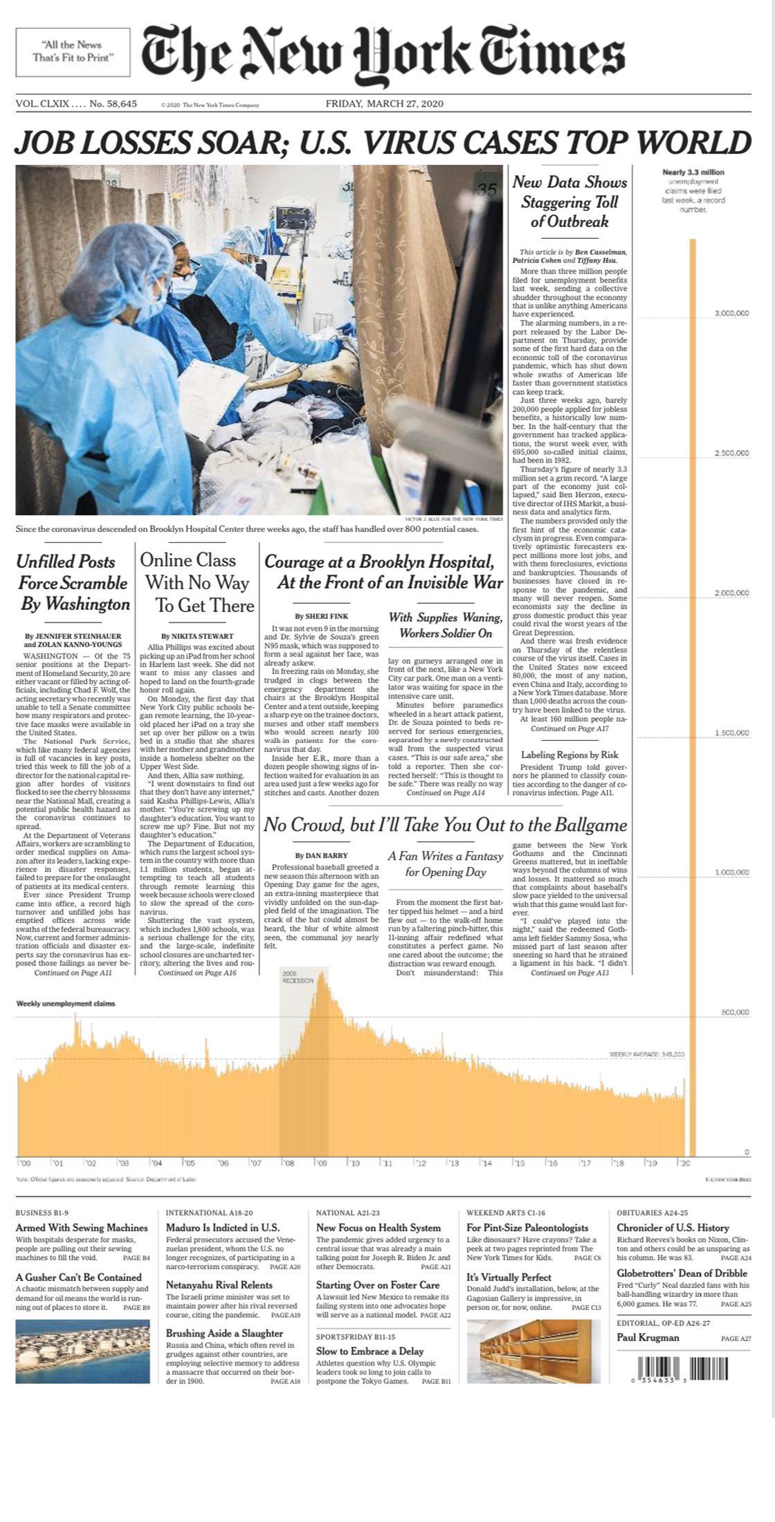
Some images use scale to convey just how exceptional the present moment is. The virus has unleashed devastating volatility in financial markets and throughout the wider economy—a domain long associated with visual representations.3 The front page of the March 27 edition of The New York Times featured what might usually be a significant but familiar graph: a histogram plotting the number of weekly unemployment claims over a twenty year period. featuring an expected peak around the period of the 2008 financial crisis. However, as the reader moves their eyes from left to right, from the past toward the present, the final column of the histogram explodes off the scale, breaking into the text of the articles that surround it to occupy the entire right-hand column of the page. This brilliant mixed-media layout makes visible in ways that numerical values cannot that we are living in a moment of outliers, of exceptions to the rule.
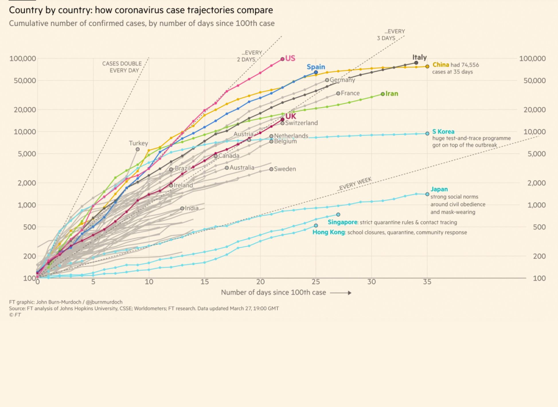
Other images allow us to make comparisons out of such exceptional cases. One of the most widely circulated images of the pandemic has been a series of annotated charts produced by the journalist John Burn-Murdoch and colleagues for the Financial Times.4 These charts plot the number of cases (or other categories, such as deaths) in logarithmic form on the y-axis, while the x-axis is scaled linearly in units of days, since the 100th case. By rendering distinct national or regional cases commensurate in the temporal sense, viewers can spatially grasp variation or even patterns in the dependent variable on the y-axis.
The Financial Times graphs are even annotated with hypotheses about why certain countries seem to have better managed the virus. For South Korea, a “huge test-and-trace programme got on top of the outbreak.” While these explanations can only be provisional, they are nonetheless generative, an exploratory step in producing firmer knowledge about the effectiveness of social responses to the pandemic at national and regional levels. It has long been a truism that journalism is a first rough draft of history. Here, the visualizations of data journalism may be rough drafts of epidemiological insights.
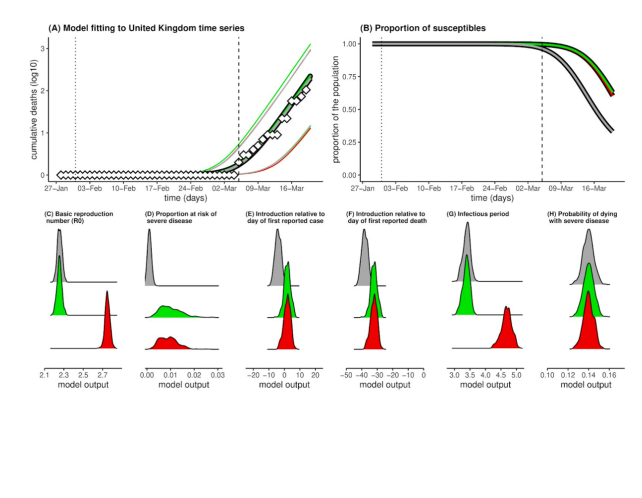
Perhaps the most significant images of the COVID-19 pandemic are not representations of existing observations but more speculative models that visualize possible futures. The intense public interest in the pandemic has collapsed certain models into a sort of shorthand for future expectations and political positions. For example, the “Oxford study,” a non-peer-reviewed preprint received significant media attention when one of its simulations suggested that as much as 68% of the population of the United Kingdom—more than 30 million people—had already been infected as of late March.5 Some interpreted these projections to mean that the vast majority of cases would be mild or even asymptomatic and that a “herd immunity” strategy may be viable.6
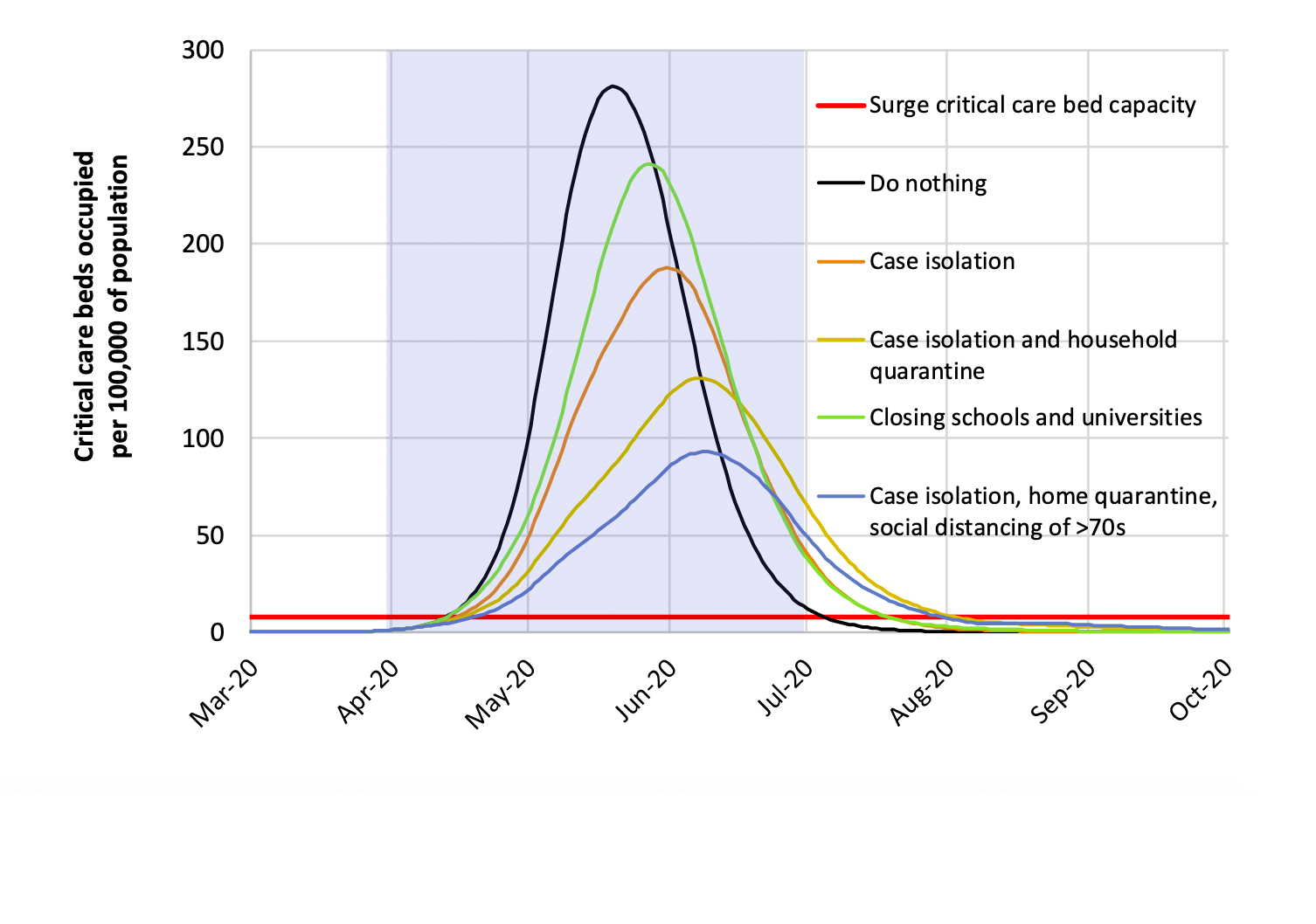
Another model, widely known as “The Imperial College study” painted a much more worrying picture of the capacity of Great Britain’s healthcare system.7 This study, directed by Neil Ferguson, included a set of scenarios that plotted projected cases under different mitigation strategies. Building on the experiences of Italian healthcare workers, it also included a baseline of critical care surgical beds. The resulting graph suggested that a more minimalist approach to containing infection would quickly overwhelm the healthcare system’s ability to treat the most serious cases requiring intensive or critical care.
These models have quickly taken on political valences. The Imperial College model, in particular, has been credited with reversing the course of the U.K. government’s early herd immunity strategy. Within a week of the publication of his model Ferguson was called to testify before a parliamentary committee, where he expressed optimism that a combination of mitigation efforts and increased capacity would prevent the National Health Service from being overwhelmed.8
It is both understandable and desirable that expert modelers have worked quickly to produce simulations. Emergencies do not wait for peer review, and politicians must act in the present. However, there is also danger in the uncritical circulation of decontextualized visualizations or headline statistics. As these images travel, their parameters, assumptions, and underlying uncertainty may be concealed or even naturalized; simulations may look more and more like observational records.9 The philosopher Georges Canguilhem termed these cases “scientific ideologies,” which draw on the techniques and concepts of a science but overstep its legitimate domains. The truth of ideological visualizations, to paraphrase Canguilhem, lies not in what they picture, but in what they hide.10 All visualizations, not only future-looking models, are sensitive to classification systems, design decisions, and data collection practices. The failure of governments to rapidly scale up testing represents a significant data collection problem in this regard.
Scientists will surely improve their models as the dynamics of COVID-19 infection are better understood. But there is a deeper way that these images have already transformed public knowledge of the pandemic. We will not only understand it in these visual terms but also act according to them. The signature response to the crisis, the imperative to “flatten the curve,” interpellates subjects as data points, perhaps isolated by social distancing, but nonetheless related as part of larger social formations or populations threatened by the pandemic. These images of the pandemic produce a social imaginary expressed as curves and distributions. The “data” in these data visualizations cuts against its original Latin meaning of “given.”11 The flattened curve is rather a norm in the moral or political rather than statistical sense. It is an “ought” that may become an “is,” a desired future, producing a sense of hope that if we can envision a way to end the acute phase of the pandemic, that it will end.
Cite this article:
"Campolo, Alexander. 2020. Flattening the Curve: Visualization and Pandemic Knowledge, April 1, 2020. Formations, The University of Chicago https://sifk.uchicago.edu/blogs/article/flattening-the-curve-visualization-and-pandemic-knowledge/"
Footnotes
1 Stephen A. Lauer et al., “The Incubation Period of Coronavirus Disease 2019 (COVID-19) From Publicly Reported Confirmed Cases: Estimation and Application,” Annals of Internal Medicine, March 10, 2020, https://doi.org/10.7326/M20-0504.
2 Edward R. Tufte, The Visual Display of Quantitative Information, 2nd edition (Cheshire, CT: Graphics Press, 2001), 24.
3 Susan Buck-Morss, “Envisioning Capital: Political Economy on Display,” Critical Inquiry 21, no. 2 (January 1, 1995): 434–67.
4 John Burn-Murdoch et al., “Coronavirus Tracked: The Latest Figures as the Pandemic” Financial Times, February 8, 2020, https://www.ft.com/content/a26fbf7e-48f8-11ea-aeb3-955839e06441.
5 Jose Lourenco et al., “Fundamental Principles of Epidemic Spread Highlight the Immediate Need for Large-Scale Serological Surveys to Assess the Stage of the SARS-CoV-2 Epidemic,” MedRxiv, March 26, 2020, 2020.03.24.20042291, https://doi.org/10.1101/2020.03.24.20042291.
6 Tim Harford, “Why It’s Too Tempting to Believe the Oxford Study on Coronavirus,” Financial Times, March 27, 2020, https://www.ft.com/content/14df8908-6f47-11ea-9bca-bf503995cd6f.
7 Neil Ferguson et al., “Impact of Non-Pharmaceutical Interventions (NPIs) to Reduce COVID-19 Mortality and Healthcare Demand” (Imperial College London, March 16, 2020), https://www.imperial.ac.uk/media/imperial-college/medicine/sph/ide/gida-fellowships/Imperial-College-COVID19-NPI-modelling-16-03-2020.pdf.
8 James Gallagher, “Analysis: UK Changes Course amid Death Toll Fears,” BBC News, March 17, 2020, https://www.bbc.com/news/health-51915302.
9 Ian Sample, “Coronavirus Exposes the Problems and Pitfalls of Modelling,” The Guardian, March 25, 2020, https://www.theguardian.com/science/2020/mar/25/coronavirus-exposes-the-problems-and-pitfalls-of-modelling.
10 Georges Canguilhem and François Delaporte, A Vital Rationalist: Selected Writings from Georges Canguilhem (New York: Zone Books, 2000), 39–40.
11 Daniel Rosenberg, “Data as Word,” Historical Studies of Natural Science 48, no. 5 (November 1, 2018): 557–67, https://doi.org/10.1525/hsns.2018.48.5.557.

The front page of The New York Times, March 27, 2020.

The Financial Times' visual representation of the coronavirus pandemic.

Results of simulations from the Oxford study. In one simulated scenario, 68% of the United Kingdom’s population had already been infected.

A set of scenarios under different mitigation strategies compared with critical care bed capacity from the Imperial College study.
